Monday, December 3, 2012
4-Ancestors Oracle at GEDmatch
The Jtest and EUtest at GEDmatch now include a new tool called the 4-Ancestors Oracle (aka. Oracle-4), as well as the 3D PCAs I promised earlier. Oracle-4 will attempt to pinpoint your ethnic group of origin, and then also work out the most likely combinations of two, three and four ancestral populations which make up your genome. However, this doesn't mean the results will actually show your ethnic group, or those of your parents (in dual mode) or grandparents (4-way mode). They might for many people, but for others they'll reflect the best possible outcomes from the reference samples available.
GEDmatch Ad-Mix Utilities
Enjoy, and feel free to give feedback to John at GEDmatch if you think it might be useful (but please don't spam his account).
Thursday, September 27, 2012
Jtest K14 - the Eurogenes Ashkenazi ancestry test
Update 19/03/2018: It's come to my attention that many people are still using the Jtest and taking the results very seriously. Indeed, perhaps too seriously.
Also, some users are doing weird stuff with the Jtest output in an attempt to estimate their supposedly "true" Ashkenazi ancestry proportions, like multiplying their Ashkenazi coefficient by three, because Ashkenazi Jews "only" score around 30% Ashkenazi in this test. Ouch! Please don't do that!
Let me reiterate that this test was only supposed to be a fun experiment. It was never meant to be the definitive online Ashkenazi ancestry test. And even as fun experiments with ADMIXTURE go, it's now horribly outdated, and probably useless for anyone with less than 15-20% Ashkenazi ancestry.
So it might be time to move on. If you really want to confirm your Jewish ancestry, either or both Ashkenazi and Sephardi, then you need to look at much more powerful and sophisticated options. One of these options is the Global25 analysis (see HERE), which can pick up minor Jewish ancestry of just a few per cent. But it's not free (USD $12), and it's a DIY test that requires a bit of time and effort to get the most out of it. Also, you'd need to send me your autosomal file so that I can estimate your Global25 coordinates. But I can help you get started and even quickly check if you have any hope at all of confirming Jewish ancestry.
If, for whatever reason, you'd rather not take advantage of the Global25 offer, because, say, you don't want to share your data with me, then it might be an idea to join the Anthrogenica discussion board and ask the experienced members there about other options [LINK].
In any case, whatever you choose to do, please remember the following points, and feel free to share them with others who are still using the Jtest:
- do not multiply your Jtest Ashkenazi score by 3 in an attempt to find your "true" Ashkenazi ancestry proportion, because this won't work for the vast majority of users...
- but do compare your Jtest Ashkenazi score to those of other people of the same or very similar ancestry to yours to get a rough idea whether you might have any Ashkenazi ancestry (the Jtest population averages will be useful for this, see here)
- if you're still not sure what your Jtest results mean, then just focus on your Jtest Oracle-4 output at GEDmatch, and if you don't see AJ at the top of the oracle list, then this is a strong signal that you don't have substantial Ashkenazi ancestry
I recently learned that the new Ancestry Painting at 23andMe will include an Ashkenazi reference group. To be honest, I’m not sure there’s much value in using a genetically bottlenecked population of varied biogeographical origins as a reference in such things. Indeed, the Ashkenazi mainly descend from a few hundred founders, but carry Central European, Eastern European, Middle Eastern, African and probably many other admixtures, as evidenced by their genome-wide and uniparental markers.
That’s quite a problem, because due to their relative inbreeding, they produce strong ancestral clusters in many analyses, like in ADMIXTURE runs. However, these clusters are made up of allele frequencies from a wide range of sources and, paradoxically, it’s the relatively more outbred populations which contributed to the Ashkenazi gene pool at its formative stages that often end up showing Ashkenazi admixture in such tests, despite not having any. I've seen this happen regularly in my experiments with ADMIXTURE and STRUCTURE, and I'm pretty sure I could find an example in a peer reviewed study if I tried.
That’s just how things work with the algorithms we have available to run these sorts of tests. Nevertheless, since 23andMe is incorporating an Ashkenazi cluster into its new painting, I thought I’d try and come up with an Ashkenazi ancestry test to perhaps get a rough idea of what we might expect. I'm using ADMIXTURE in supervised mode, and basically trying to recreate clusters that have shown up in a variety of fine-scale analyses, including my ChromoPainter run of Northern European samples. It’s still a work in progress, but below are links to files that many of you might find useful..
Jtest K14 files
Jtest averages for selected populations
EUtest K13 files
EUtest averages for selected populations
The Jtest folder contains files that can be used to make an Ashkenazi ancestry test/chromosome painting with 14 Eurasian and African clusters. The EUtest folder contains the same files, except that the Ashkenazi allele frequencies have been removed. It’s useful to cross check results from both tests, mainly to see what’s hiding under the Ashkenazi admixture if it shows up in the Jtest.
Based on a few test runs today, I’d say that the noise level for the continental clusters is much less than 1%. But it rises to a few per cent for the intra-West Eurasian clusters. In other words, if you’re European, then you might score something like 0.02% in the Sub-Saharan cluster, which basically means 0%. However, you might get around 2% in the Middle Eastern cluster, even though you’re from Central Europe, and you don’t have any recent Middle Eastern ancestry. You can blame various prehistoric and historic migrations into Europe for these seemingly quirky results, and also the fact that Mesolithic Europeans were significantly Eurasian (i.e. Siberian, Amerindian and South Asian-like).
The Ashkenazi cluster is very similar to the Middle Eastern cluster in that regard. So anyone who gets an Ashkenazi score of around 2-3% either has very distant Jewish ancestry or, more likely, none at all. However, those who show more than 25% membership in that cluster are almost certainly of fully Ashkenazi ancestry, and their genomes peppered with Ashkenazi-specific chromosomal segments.
There’s really not much difference between 2% and 25%, you might say. In fact, there is if we say there is. As always, the main thing to remember is that these clusters don’t really exist, because genetic variation is clinal, so the cluster names are basically arbitrary and it’s always the relative results that matter.That’s why to really understand what your scores mean, you need to compare them with those of other users.
Obviously, it's best to compare with people from the same ethnic and/or regional groups. If the Ashkenazi + East Med scores look relatively inflated, that's a sign of recent Ashkenazi ancestry.
Feel free to use the files above for anything you want, except commercial stuff. Please note, I make no guarantees that they’ll provide accurate results for everyone. I might update this post early next week with new and/or additional files and more tips.
...
Update 6/10/2012: The Jtest K14 and EUtest K13 will soon be available at GEDmatch, accompanied by an "Oracle" population matching analysis and maybe even a 3D genetic map. If all goes to plan, the population matching test should be able to give a decisive yay or nay to anyone wondering whether they have recent Ashkenazi ancestry.
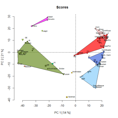
By the way, below is a PCA based on the Jtest averages for selected populations. It was produced by one of my project members so that we could check the reliability of the 14 "ancestral" components. The samples were classified into clusters based on their highest peaking component. So, for instance, the Scots are in the light blue Atlantic cluster, along with French Basques, because the Atlantic component dominates in both groups. However, overall, they're more similar to other samples than to each other.
As per above, the plan is that GEDmatch will soon offer a 3D genetic map based on the loadings from this PCA analysis.
Update 11/10/2012: The Jtest and EUtest are now on offer at GEDmatch. The quickest way to get there is via this link to the Ad-Mix page. Then, from the drop down menus, choose Eurogenes, followed by Jtest.
First run the Admix test to check whether your Ashkenazi admixture is significantly higher than expected for your part of the world (as per above, Jtest averages for selected populations are available here). Then move on to the Oracle analysis by pressing the relevant button at the bottom of the page.
If your Ashkenazi admixture is clearly elevated, and the top 20 single and/or mixed mode Oracle results show AJ (Ashkenazi Jews) as one of your potential matches, then it’s likely you have recent Ashkenazi ancestry.
Whether that’s the case or not, you can then move on to the Chromosome Painting feature to see where the potential Ashkenazi admixture is located in your genome. It’s useful to cross check the results with those from the Ancestry Finder at 23andMe to assess their accuracy.
As already mentioned, the EUtest is exactly the same as the Jtest, but with the Ashkenazi allele frequencies taken out. You can use this option to see what’s hiding under your Ashkenazi admixture in the Jtest. To compare your results with those of selected populations from Europe, Asia and Africa, refer to the EUtest averages sheet.
Please note: it's important to interpret the results with insight. You need to learn how the system works, pay attention to the types of populations that appear in your results, consider carefully why they might be paired with other populations, and of course study the statistics in detail. Expecting a bullseye classification at the top of the Oracle list is likely to lead to major disappointment for many people, simply because I don't have enough samples to represent all of the substructures that exist around the world, especially within countries.
I’ll try and update both tests in a few weeks, after seeing how successful the whole set up is at predicting Ashkenazi admixture and locating it in the genome. One of the main goals will be to improve the accuracy of the Oracle analysis for everyone, including New World people with Amerindian admixture.
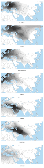
Update 21/10/2012: Below are spatial maps of a few of the ancestral clusters from the Jtest, courtesy of project member FR7.
Update 4/12/2012: The Jtest and EUtest at GEDmatch now include a new tool called the 4-Ancestors Oracle (aka. Oracle-4), as well as the 3D PCAs I promised earlier. Oracle-4 will attempt to pinpoint your ethnic group of origin, and then also work out the most likely combinations of two, three and four ancestral populations which make up your genome. However, this doesn't mean the results will actually show your ethnic group, or those of your parents (in dual mode) or grandparents (4-way mode). They might for many people, but for others they'll reflect the best possible outcomes from the reference samples available.
Enjoy, and feel free to give feedback to John at GEDmatch if you think it might be useful (but please don't spam his account).
Saturday, May 26, 2012
Beware of the "calculator effect"
Many people are getting skewed results from so called DIY admixture calculators. For instance, users from the UK often come out much more continental European than they should. Some of them actually believe that this is because they're genetically more Norman or Saxon than the average Brit.
No, the real reason is what I call the "calculator effect". This is when the algorithm gives different results to people who are part of the ADMIXTURE runs that produced the allele frequencies used by the calculators, than to those who aren't, even though both sets of users are of exactly the same origin, and should expect basically identical results.
So, is it possible to get around this calculator effect? Yes, people who aren't included in the datasets that produce the allele frequencies used by the calculators shouldn't compare their results to those who are, including the academic references used. They should only compare results to those of other calculator users. On the other hand, members of the various projects who are run as references, should only compare their results to other project members and relevant academic references.
I've put together a quick experiment to show the "calculator effect" in full force. I ran two intra-North European ADMIXTURE analyses at K=3, Test1 and Test2, and included myself (PL1) only in the former. These tests were almost identical, except for the fact that I wasn't part of the second run. I then tested my genome with calculators made from the allele frequencies from the two runs.
My calculator results for Test1 were very similar to the results I received from ADMIXTURE, and made perfect sense based on my ancestry. However, the calculator results for Test2 were way off, and basically made me look like a different sample from some other part of Europe. I even managed to score above noise level Far Eastern ancestry in the calculator version of Test2. Please note, however, that all the other individuals received almost identical scores in both tests. The results from the experiment can be seen in the spreadsheet below.
Calculator Effect K=3
I have to say I'm disappointed that no one else is talking about the calculator effect, and how to remedy it. I actually designed my Eurogenes ancestry tests for Gedmatch with this problem in mind, by only using academic references to source the allele frequencies. This means that test results for Eurogenes project members and non-members are directly comparable. Perhaps other genome bloggers can eventually do the same?
See also...
Ancient genomes and the calculator effect
Saturday, April 21, 2012
So who's the most (indigenous) European of us all?
Basically, the first map below reveals the answer. It shows the spread of a European specific cluster from a global-wide ADMIXTURE analysis at K=8 (eight ancestral populations assumed), which I call "North European". Thus, genetically, the most European populations are found around the Baltic Sea, and in particular in the East Baltic region. In my genome collection, samples from Lithuania clearly and consistently score the highest percentages in ADMIXTURE clusters specific to Europe. However, I suspect that if I had Latvians with no known foreign ancestry going back more than four generations, they'd come out the "most European". Hopefully we can test that in the near future.

Below are the fifteen Eurogenes sample sets that scored the highest levels of membership in the North European cluster. The list only includes groups with five or more individuals present in the analysis, so some populations, like Estonians or Danes, weren't included, even though they easily made the cut. The spreadsheet with all the results from this run can be seen here. A table of Fst (genetic) distances between the eight clusters is available here.
Lithuanians 77%
Finns 74%
Belorussians 70%
Swedes 69%
Norwegians 68%
Kargopol Russians 68%
Russians 68%
Poles 68%
Erzya 66%
Ukrainians 66%
Moksha 66%
Orcadians 63%
HapMap Utah Americans (CEU) 63%
Irish 63%
British 62%
So why did I pick the results from K=8, and not some other K, like 2, 10, or 25? Well, it's not possible to evaluate who is more European without a European-specific cluster (ie. modal in Europeans, with a low frequency outside of Europe). Provided that a decent number and range of global and West Eurasian samples are used in the analysis, such clusters begin appearing at around K=5 or K=6, and start breaking up into local clusters from about K=9. I found that runs below K=8 produced European clusters that spilled too generously outside of the borders of Europe. On the other hand, runs above K=8 produced European clusters that weren't representative of enough European groups (ie. too localized). But the European cluster from K=8 was pretty much perfect, and I think that's obvious from the map. In fact, I can hardly believe how well it fits the modern geographic concept of Europe - north of the Mediterranean and west of the Urals. Amazing stuff.
There are two other clusters that show up across Europe in non-trivial amounts - Mediterranean and Caucasus (see maps below). These can also be thought of as native European clusters, since they've been on the continent for thousands of years. However, their peak frequencies are found in West Asia, so they're not particularly useful signals of European-specific ancestry.


So what do these three clusters show exactly? They represent certain allele frequencies in modern populations, and in fact, these can change fairly rapidly due to admixture, selection, and genetic drift. So claiming that such clusters represent pure ancient populations is unlikely to be true in most cases, if ever. However, I don't think there's anything wrong in saying that, when robust enough, they can be thought of as signals of ancestry from relatively distinct ancestral groups.
Indeed, anyone who's read up on the prehistory of Europe, knows that there are three general Neolithic archeological waves to consider when trying to untangle the story of the peopling of Europe. These are Mediterranean Neolithic, Anatolian Neolithic and Forest Neolithic (for example, see here).
Mediterranean Neolithic refers to a series of migrations from West Asia via the Mediterranean and its coasts. The areas most profoundly affected by these movements include the islands of Sardinia and Corsica, and the Southwest European mainland. Anatolian Neolithic describes migrations into Europe from modern day Turkey, mostly into the Balkans, but also as far as Germany and France. At the moment, Forest Neolithic of Northeastern Europe is something of a mystery. However, the general opinion is that it was largely the result of native Mesolithic hunter-gatherers adopting agriculture.
Obviously, it's very difficult to dismiss the correlations between these three broad archeological groups and the European and two European/West Asian clusters produced in my K=8 ADMIXTURE analysis. Is it a coincidence that the Mediterranean cluster today peaks in Sardinia, which has been largely shielded from foreign admixture since the Neolithic, and today forms a very distinct Southern European isolate? Why does the North European cluster show the highest peaks in classic Forest Neolithic territory? And why does the Caucasus cluster radiate in Europe from the southeast, which is where Anatolian farmers had the greatest impact? These can't all be coincidences, and I'm willing to bet that none of them are. I'm convinced that the three clusters from my K=8 run are strong signals from the Neolithic, and the North European cluster also from the Mesolithic.
Eventually, these issues will be settled with ancient DNA data, in a much more comprehensive way than ever possible using modern genomes. We've already seen some preliminary results, mostly from Mesolithic, Neolithic and Bronze Age sites around Europe, so perhaps it's useful to ask whether my ADMIXTURE analysis and commentary here mirror these early findings? I think they do. For instance, here's an interesting conclusion regarding the East Baltic area from a study on ancient Scandinavian mtDNA by Malmström et al.
Through analysis of DNA extracted from ancient Scandinavian human remains, we show that people of the Pitted Ware culture were not the direct ancestors of modern Scandinavians (including the Saami people of northern Scandinavia) but are more closely related to contemporary populations of the eastern Baltic region. Our findings support hypotheses arising from archaeological analyses that propose a Neolithic or post-Neolithic population replacement in Scandinavia [7]. Furthermore, our data are consistent with the view that the eastern Baltic represents a genetic refugia for some of the European hunter-gatherer populations.
I suppose there will be people wondering why I didn't take Sub-Saharan African, East Asian, and South Asian admixtures into account in my analysis. The reason is that I wasn't looking at which group was most West Eurasian, or Caucasoid. Based on everything I've seen to date, in my own work as well as elsewhere, the most West Eurasian group would probably be the French Basques from the HGDP. However, the differences between them, and certain groups from Northeastern Europe, like Northern Poles and Lithuanians, really wouldn't be that great anyway. I might do a write up about that at some point.
Credits...
- Maps by Eurogenes project member FR7
- Additional stats by Eurogenes project member DESEUK1
References...
Helena Malmström et al., Ancient DNA Reveals Lack of Continuity between Neolithic Hunter-Gatherers and Contemporary Scandinavians, Current Biology, 24 September 2009, doi:10.1016/j.cub.2009.09.017
Noreen von Cramon-Taubadel and Ron Pinhasi, Craniometric data support a mosaic model of demic and cultural Neolithic diffusion to outlying regions of Europe, Proc. R. Soc. B published online 23 February 2011, doi: 10.1098/rspb.2010.2678
Sunday, February 26, 2012
Genetic substructures within the HapMap CEU sample (and Eurogenes' Northwest Europeans)
In this experiment I attempt to characterize more precisely the origins of some of the individuals from the HapMap CEU cohort. These samples are described by the HapMap project as Utah Americans of Western and Northern European descent. But this doesn't seem to be exactly true for at least two of them, who actually come out very Central European in all my tests. Moreover, it's obvious that some of the samples fit nicely into very specific areas of Western and Northern Europe. For instance, at this level of resolution, a few could pass as Irish, and others for Danes or even Swedes. Below is a quick and dirty ADMIXTURE analysis designed specifically for this experiment.

Key: Red = Sub-Saharan African, Yellow = Southern European, Green = North-Central European, Aqua = North Atlantic, Blue = Baltic, Pink = East Asian. See spreadsheet for details.
Based on the K=6 results it's fair to say that at least six of the CEU samples might pass for unmixed Scandinavians, most likely Danes or southern Swedes (NA12003, NA12057, NA12248, NA12249, NA12776 and NA12875). At least five could be confused for Irish or western British samples (NA10850, NA12005, NA12006, NA12386 and NA12812). The two Central European-like Utahns stick out from the CEU set due to their unusually high Baltic scores (NA11917 and NA12286). From the little I know about the CEU samples, I'd say that these two were of eastern or southeastern German origin. But they might have fairly recent ancestry from further east than that. My own MDS analysis (first image below) and a PCA plot from Lao et al. 2008 (second image, slightly edited by me to remove article text) confirm that such Scandinavian-like, German-like and Irish-like individuals do exist in the CEU set.


So the CEU set is not a homogeneous one, and carries clear substructures that can be picked up via fairly basic means. However, this doesn't make the CEU samples less valuable, but more so, due to the lack of public access to continental Northwestern European samples. Secondly, the test reveals some interesting information about the genetic substructures within Northwestern Europe. Here are some of my observations:
- Scandinavians often show very high levels of the North-Central European component, and moderately high levels of the North Atlantic component. Many also carry clear amounts of the Baltic component, but, as a rule, lower levels of the Southern European component.
- Germans mainly differ from the Scandinavians in that they carry the Southern European component at appreciable amounts. They show variable amounts of the Baltic component, with those from eastern Germany carrying the highest levels.
- Irish project members, especially those from western Ireland, show very high levels of the North Atlantic component, but low levels of the Southern European component.
- Western British samples, like those from Cornwall or western Scotland, are generally very similar to the Irish, mainly in that they carry the North Atlantic component at high levels. However, they often show somewhat higher levels of the Southern European component.
I'm eventually going to test these classifications of the CEU samples with ChromoPainter, which is by far the most accurate tool for such things at the moment. Unfortunately, it's also a lot of hard work and computationally intensive, so it might take a few weeks. I do have the allele frequencies from the above ADMIXTURE run, and it is possible to make a stand alone test from them. However, I'm not certain that's a good idea at present, due to the small number of samples involved. It might be worth doing when the right samples swell in number, so I can run a more robust analysis. In particular, I need more people from Ireland, Scotland and Scandinavia.
Reference...
Oscar Lao et al, Correlation between Genetic and Geographic Structure in Europe, Current Biology, Volume 18, Issue 16, 1241-1248, 26 August 2008, doi:10.1016/j.cub.2008.07.049
Monday, January 23, 2012
Eurogenes' North Euro clusters - phase 2, final results
This is a continuation of my ChromoPainter analysis of Europeans from north of the Pyrenees, Alps and Balkans (see here). To obtain the most accurate results possible on my laptop, I increased the burn-ins and iterations in fineSTRUCTURE to 500K each (5 hour run in all, which is all I'm willing to put this machine through). The end product looks very similar to my initial analysis, in which I explored the data at 200K burn-ins and iterations. What I think this shows is that the results are robust, and I doubt they'd change much even after a couple of days of running fineSTRUCTURE.
Indeed, as mentioned in my previous blog entry, this appears to be the most detailed and accurate cluster analysis of this part of Europe produced anywhere to date. There are 21 clusters in all, with at least 20 looking like strong signals of genetic substructures across North, West, Central and East Europe (see spreadsheet for individual classifications). They include:
pop0 - West Finnish1: This is a pair of reference individuals, most likely from Western Finland, judging by their PCA and ADMIXTURE results. They are either from the same community, or have a very similar mix of very specific ancestries.
pop1 - Erzya + Moksha: This includes all of the Erzya and Moksha in the project, plus a Russian with recent Erzya ancestry. It's closely related to ethnic Russian clusters that stretch from Northwest Russia to near the Volga, and also to the Estonian cluster.
pop2 - South/Central Finnish: This is the largest Finnish cluster, and that's probably more than just the result of sampling bias. I would say that the greater part of the Finnish population would belong to this type of cluster, which occupies regions of highest population density within the country.
pop3 - Fenno-Scandian: This cluster includes a Northern Swede, a Swede with probable recent Finnish ancestry, and Finns with probable recent Swedish influence. I have a feeling that Finland Swedes and Aland Islanders would also be placed here more often than not.
pop4 - Northwest Russian/Southeast Finnish: Although this cluster includes only two individuals, it's definitely much more than just the result of two relatively closely related samples being in the same run. I'd hazard a guess that Northwest Russians with, say, significant Ingrian ancestry, would land here, and so would Finns with recent Russian ancestry.
pop5 - West Finnish2: Based on PCA and ADMIXTURE results, most of these Finns likely come from Western Finland, probably from places like Southern Ostrobothnia. They possibly also have some Swedish influence.
pop6 - West German: This cluster is based on individuals from Western and Northwestern Germany. It also includes a Dutchman, Austrian and people of mixed origin, like a Dane with French and German ancestry, and Americans with British, German, Scandinavian and/or Polish ancestry. In other words, this is where Northwestern Europe meets Central Europe.
pop7 - Vologda Russian: Most of the Vologda Russians from the HGDP land here, so this appears to be a local cluster. Judging from its phylogeny, it looks like a mix of North Slavic, Baltic and Finnic influences.
pop8 - East Finnish: All the project and reference Finns with substantial ancestry from new settlement areas of Eastern Finland appear in this cluster. No wonder then, that this is the cluster with the highest chunk count in this analysis.
pop9 - Estonian: This is a mixed cluster, including individuals from Estonia, and, as far as I know, Russians with substantial ancestry from near Estonia. As mentioned above, it's closely related to the Erzya + Moksha, Northwest Russian and Vologda clusters. However, it's clearly much more western than any of these clusters (for instance, see the PCA below), which suggests Germanic influence in its makeup.
pop10 - Cornish: Almost all of my Cornish samples from the 1000 Genomes Project feature in this very local cluster, which shows the highest chunk count among the Western European samples. The overall results suggest a lack of outbreeding in recent times.
pop11 - French/Belgian: Interestingly, this cluster includes the bulk of the French samples, a French Canadian, and two Belgians. On the other hand, the most northerly French are placed in the more cosmopolitan Northwest European cluster (see below).
pop12 - Lithuanian: All of the more or less pure Lithuanians fall in this cluster. Those that don't are a reference sample from Behar et al. 2009, who always appears very Belorussian like in other analyses, and here sits in the East Slavic cluster, and a project member with recent German ancestry (LIT3). The Western European influence carried by the latter pushes him into the Polish/West Ukrainian cluster, despite not having any documented Polish or Ukrainian ancestry.
pop13 - Northwest Russian: This cluster appears to be made up of Russians who have more Finnic, and/or perhaps Eastern Baltic, ancestry than the individuals in the East Slavic cluster. In other words, it's more northerly, less westerly, and more closely related to the Finnic-speaking Erzya, Moksha and Estonians.
pop14 - Irish + West British: Most Irish individuals fall in this cluster, as well as British samples from Western Scotland and Wales. It's tempting to correlate this cluster with Celtic genetic ancestry in the Isles.
pop15 - South/West Scandinavian: This is basically a Norwegian and Southern Swedish cluster. It also features Swedes from other parts of the country who most likely have some German, Walloon and/or French influence.
pop16 - East German: This cluster includes individuals with significant or even overwhelming Germanic ancestry, but also with very clear Western Slavic input. One of the individuals here is of mixed Polish, German and Swedish ancestry, which pretty much sums up the character of this cluster in a modern context. The presence of two Hungarians from Behar et al. 2009. isn't surprising, because Hungary was settled by both Germanic and Western Slavic groups from the early Middle Ages until modern times.
pop17 - Northwest European: I had reasonable hopes of breaking up this large cluster into a couple of units at least. However, that did not happen, and I don't think it will unless I obtain more samples from the relevant areas of Europe, like Holland and specific parts of the UK. I think the main reason this cluster failed to budge was because of its cosmopolitan nature. In other words, the samples here include some of the most outbred in the analysis, and this, coupled with the fact that they carry very similar ancestral components, means that fineSTRUCTURE doesn't have anything to latch onto to create divisions.
pop18 - East Scandinavian: This could also be called a Swedish cluster. It's almost entirely made up of Swedes, usually from Eastern or Southeastern Sweden, and/or occasionally with recent Finnish influence.
pop19 - Polish/West Ukrainian: The vast majority of the Poles fall in this cluster, and about half of the Ukrainians from Yunusbayev et al. 2011. Most of these Ukrainians appear to be from the Lviv district in the west, and some might even have fairly recent Polish and/or German ancestry. In fact, I would say the latter is a good bet for UkrLv240Y, who shows large Western European segments on several chromosomes.
pop20 - East Slavic: All of the Belorussians cluster here, and so do Russians from near Belorussia and Ukraine, and almost half of the Ukrainians from Yunusbayev et al. 2011 (those who show more easterly genetic characteristics). An individual of mixed Polish and Lithuanian ancestry also makes an appearance here, suggesting that one of the main factors differentiating this cluster from the Polish/West Ukrainian group is a higher level of Baltic admixture in the former.
pop21 - East Central European: This cluster is based on most of the Hungarians in my dataset, but it also includes a number of Western and Southern Slavs, often with significant German ancestry. Not surprisingly, this cluster shows very high affinity with both the East German and Polish/West Ukrainian clusters.
Let's now move on to some graphics. Below, in order of appearance, are the following: raw data coancestry matrix, showing the placement of individual samples; aggregate coancestry matrix, showing the populations (or clusters) described above; pairwise coincidence matrix, which is useful for spotting very recent ancestral ties; a PCA plot of the 21 clusters. More detailed ChromoPainter/fineSTRUCTURE PCAs of Western Europe can be found at this link.


 Finally, those of you who wish to run your own experiments with the ChromoPainter datasheets from this analysis can download them here. Please note, the sheets don't reveal any raw or traits/disease data.
Saturday, January 14, 2012
Eurogenes' North Euro clusters - phase 1, exploring the data
I have some preliminary results from a new intra-North Euro cluster analysis, using a cutting edge tool called ChromoPainter. More than 400 samples and 270K SNPs were tested, in linkage mode, and then the output processed in fineSTRUCTURE at 200K burn-ins and iterations. Like I say, the results should be treated as preliminary, but they already look better than any other cluster analysis I've ever seen dealing with Europe north of the Alps, Pyrenees and Balkans. The algorithm identified 21 clusters, with most located in Eastern and Northeastern Europe (see spreadsheet for details). Below are two plots showing how the clusters relate to each other via a tree diagram and heat maps – the first shows an aggregate view, and the second the individual samples.


It's interesting that the Baltic Finns seem to create clusters at a drop of a hat, but they also share the highest number of chunks, and the longest chunks, than any other group. Indeed, all of the Finnish clusters are closely related, and many of the individuals, especially from East Finland, even look like distant relatives on the heat map (note the ultra-hot, blue squares). On the other hand, the large Northwestern European cluster, featuring samples from across the UK, as well as from several nearby countries, is holding firm, and might be tough to break up in this analysis.
I have some theories about the reasons for the obvious genetic homogeneity and diversity in Western Europe, and these include the effects of the Black Death. It decimated many populations in the western half of the continent, thus encouraging migrations into emptied areas, and eventually leading to more open, mobile societies. It's an interesting subject, and I might write much more on it in the future. Meantime, here's a PCA plot from the ChromoPainter chunk counts data. Note the large distances spanned by groups from Northern and Eastern Europe, and the tight bundle of samples from the west, mostly from the UK, Ireland, France and the Low Countries. Interestingly, and perhaps counter-intuitively, it's the closely related Finns who take up most of the space on the plot.

The first component picked up by this PCA appears to be an Atlantic one. It peaks in the Cornish samples, but shows similar levels in all the British, Irish, French, Dutch and Belgians (post-Black Death mobility?). If we are to assume that I identified the component correctly, then it appears as if the East Finns, Vologda Russians, Erzya from the Middle Volga, and Lithuanians are the least “Atlantic” samples in this analysis. These groups, especially the East Finns, also happen to act like relative genetic isolates in many of my experiments (such as ADMIXTURE and MDS analyses). Thus, it seems they've been sheltered from significant gene flow from outside in recent times, including from the west, like German migrations to East Central Europe, and Scandinavian influence in Western and Southwestern Finland.
The analysis also produced a lot of detailed data showing phased half-segment matches between all individuals. In theory, it should be possible to use this information to create chromosome paintings for the people involved - much like the Ancestry Painting feature at 23andMe, but obviously with 21 potential North European reference groups, instead of 3 inter-continental ones. We shall see how that works out.
I'll stop rambling at this point, and attempt to break up that large Northwestern cluster (Pop21), and perhaps also the French cluster (Pop7). If they don't budge this time, perhaps they will in future runs with more samples? Indeed, I'd like to try a Eurasian-wide analysis, but might need more powerful hardware for that sort of an undertaking.
Update: Eurogenes' North Euro clusters - phase 2, final results
Subscribe to:
Posts (Atom)